
Discover how plate coloration affects food presentation in unexpected ways. Explore the implications of hue, saturation, and brightness on dining experiences.
The Art of Creating Appetizing Dishes Through Plate Coloration
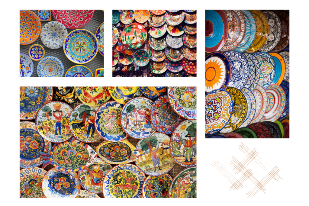
It’s no secret that the art of plate color is a game-changer in the kitchen. The use of plates with contrasting colors is one method of improving food presentation and, by extension, raising the dish’s perceived attractiveness to diners. It’s no wonder that this method, which has been used by great cooks for ages, has become so integral to modern cuisine.
To make their food stand out, chefs often utilize unconventional color combinations, such as juxtaposing dark blues with dazzling oranges or matching rich reds with vivid greens. Diners are intended to feel a range of emotions, from exhilaration to calmness, via the employment of carefully curated color palettes. Additionally, the art of plate coloring goes beyond simply using colors, and also includes the placement of food on plates to produce visually pleasing patterns and textures.
Color theory and the psychology of color are essential tools for chefs who want to perfect the art of plating. In addition, they need to be able to blend different flavors and textures as well as different forms and colors to make a meal that is both visually appealing and delicious. The skillful use of plating color may transform even the most basic meal into a work of art.
Exploring the Cultural Significance of Plate Coloration in Food Presentation
Experts have spent years studying the intriguing issue of the cultural importance of plate coloring in the presentation of food. The hues of one’s meal may represent one’s feelings, values, or even one’s religion in various societies. The use of certain colors in food might be offensive to some customers, therefore chefs must be aware of the cultural meaning of the ingredients they use.
For instance, in many Asian cultures, the color red is used to decorate food for special occasions because it symbolizes good fortune, wealth, and joy. Similarly, in certain African societies, the color green is used in foods made for pregnant women or at harvest festivals because it is seen as a sign of fertility, growth, and wealth.
Not only does the color of a plate have cultural importance, but so does the way in which food is presented on the dish. For instance, in Japan, where the art of food presentation is highly valued, chefs may typically train for years to perfect their techniques.
Chefs should give thoughtful consideration to the cultural relevance of plate colors in food presentation to ensure that their meals are both aesthetically pleasing and respectful to local customs and traditions. Chefs may impress their guests with foods that are both aesthetically beautiful and culturally significant by learning about the symbolism of color in many cultures and perfecting the art of plate decoration.
Plate Coloration and its Effect on Food Perception: A Scientific Study
Several scientific research throughout the years have examined the impact of plate color on the way food is perceived. These investigations have inquired into the hypothesis that the color of plates used in the presentation of food influences diners’ perceptions of the dish’s flavor, flavor intensity, and overall quality. Many new insights on the significance of plate colors in the culinary realm have emerged from this research.
In light of recent studies, it’s clear that the plates you use to serve your meal may drastically alter how it’s perceived. Food presented on red plates, for instance, may be judged as sweeter than the identical meal presented on a white plate. The same may be said for the perception that food served on black dishes is more refined and elegant than the identical meal presented on a colorful plate.
The plates themselves, both in form and material, can affect diners’ impressions of their meals. Dishes with a rougher texture may make the identical dish seem heartier and more filling than those with a smoother texture. The same goes for the perception that food presented on a circular plate is sweeter than the identical meal served on a square platter.
The results of scientific research on the relationship between plate color and how people perceive the food served on it highlight the significance of giving serious thought to the color, texture, and form of plates while serving.
The Psychology of Color Perception in Plate Design
Color psychology in plate design is an intriguing topic that has received a lot of attention from chefs and other food professionals. When designing a plate, it’s important to consider not just how the colors look together, but also how they could affect the diner’s opinion of the food’s flavor and overall quality.
The colors of a dish have been found to affect guests’ moods and their enjoyment of the meal. For instance, the colors red, orange, and yellow evoke feelings of energy, joy, and heat, whereas the colors blue and green evoke feelings of peace and serenity. When designing a plate, using warm colors may make the food look enticing and interesting, while using chilly colors might have the opposite effect.
The principle of color harmony is also a part of the psychology of color perception while designing plates. When two or more colors are harmonious with one another, the result is aesthetically pleasant. By using color harmony, cooks may make dishes that are not only beautiful to look at, but also delicious. Color harmony on a plate can be accomplished by the use of complementary colors, analogous colors, or monochromatic colors.
Chefs need to give serious thought to the psychology of color perception in plate design in order to create aesthetically beautiful dishes that are both delicious and emotionally evocative. Cooks may appeal to their customers on more than just one level by learning the concepts of color harmony and using them to make visually appealing dishes that also happen to taste delicious.
The Relationship between Plate Color and Mood
Color choice in plate presentation may have a profound effect on how customers feel about their meal. Cooking with color is a great way for chefs to appeal to diners’ senses and elicit certain responses.
For instance, the hues of red, orange, and yellow illicit sensations of warmth, enthusiasm, and excitement. Diners can be primed for a culinary experience by employing these hues.
On the other hand, blues, greens, and purples—all examples of cool colors—tend to elicit sentiments of peace and tranquility. Diners can be lulled into a state of calm by the usage of these hues, increasing the likelihood that they will have a pleasant meal.
Color choice in plating may also influence how a meal is viewed. It’s common to link the colors red and orange with sweet and savory tastes, whereas green and blue are typically associated with more bitter and sour tastes. With this information in hand, cooks may make foods that are not only more appetizing to the eye, but also more satisfying to the palate.
While creating meals, chefs must take into account the psychological impact of color. Chefs may use their newfound knowledge of how color affects our perception of flavor and emotion to serve up dishes that not only taste wonderful but also leave guests feeling terrific.
Colour is a potent weapon that may be used to great effect in the design of plates, which can in turn have a profound effect on the diner’s emotional state. For maximum effect, chefs should use hues that both enhance the dish’s flavor and elicit the appropriate feelings from diners. When done well, eating experiences may be both aesthetically and emotionally satisfying, leaving diners with a positive impression.
Utilizing Color Contrast in Plate Design for Maximum Impact
Making aesthetically appealing and tasty plates relies heavily on the use of color contrast. To produce a stunning and attractive effect, utilize hues that are opposite one another on the color wheel. With this method, you may highlight individual ingredients and guide the viewer’s gaze to specific spots on the plate.
In order to make the most of a dish’s presentation, chefs might make use of color contrast in a number of ways. Putting a vivid green garnish over a bowl of red tomato soup, for instance, would draw attention to the tomatoes as the star of the meal. An additional option is to employ contrasting colors, such as a yellow curry with a purple cauliflower garnish, to produce a visually appealing meal.
Color contrast is another tool cooks have for giving plates the illusion of depth and space. They may make the meal more aesthetically attractive by utilizing contrasting light and dark hues of color. In general, using color contrast in plate design is a crucial method that may improve the presentation and appeal of foods by making them more visually appealing and delectable.
The Effect of Color Saturation on Plate Legibility
An essential but sometimes disregarded aspect of plate design is the impact of color saturation on readability. The legibility of text or design elements on a plate is strongly influenced by the color saturation (the strength or purity of a color).
High color saturation makes it harder to see writing or design elements on a plate, especially when such components are in a contrasting hue, according to studies. Diners may become frustrated because they are unable to enjoy their meal since they are unable to identify the items on their dish.
Saturated colors make it harder to read on plates, but skilled chefs may counteract this by using color contrast and strategic positioning of text and design elements. They may make the text stand out by, perhaps, using a high-contrast font in a color that contrasts with the backdrop. Furthermore, they can keep text or design elements away from the plate’s highly saturated regions, where they could be too dim to read.
While creating new plates, chefs must think about how the saturation of colors would affect how easily food can be read. Chefs may make dishes that are both beautiful and readable by utilizing techniques like color contrast, careful placement of writing, and attention to color saturation.
