
Discover the intricate blend of art and science behind sake bottle design with our expert guide. Explore the traditional and modern techniques used.
The Historical Significance of Sake Bottle Design
One may learn a lot about the history of an art form by looking at its legacy: the design of sake bottles. Sake bottle styles have changed throughout time to match shifts in consumer preferences. In this essay, we shall examine the significance of sake bottle design throughout history, from its inception to its subsequent development and evolution.
The Jomon era of Japan, which spanned from from 14,000 BC to 300 BC, is the oldest time for which a bottle of sake has been uncovered and dated. Often unglazed, these early bottles were fashioned from clay. The sophistication of sake bottle design reflects the rise in popularity of sake across Japan. Intricate drawings of landscapes, flowers, and animals were frequently used to adorn sake bottles throughout the Edo era (1603-1868).
As Japan opened up to the rest of the world in the Meiji period (1868-1912), there was a dramatic shift in the aesthetics of sake bottles. When Western-style glass bottles grew in popularity, several established manufacturers of sake bottles began using Western-style design cues in their bottles. Around this time, mass manufacturing increased, and the shape of sake bottles became standardized.
The style of sake bottles keeps developing in the modern era. Metal, plastic, and even 3D-printed ceramics are just a few of the materials and techniques being explored by today’s designers. The aesthetics of classical Japanese art, such as calligraphy and ukiyo-e prints, are also inspiring certain contemporary designers. Yet, traditional sake bottle design continues to be highly respected for its beauty and workmanship in Japan despite these shifts.
Cultural Influences on Contemporary Sake Bottle Design
The aesthetics of a sake bottle may be said to reflect both its historical roots and modern cultural influences. As Japan opens up to the rest of the world, the visual language used to package sake has evolved to become more dynamic and varied. This essay will examine the cultural factors that have had an effect on the aesthetics and practicality of modern sake bottle design.
The design of sake bottles has been inspired by international styles as Japan’s economy and culture have grown increasingly integrated into the international community. Other examples of this may be seen in the sleek, minimalist designs of today’s sake bottles, which are evocative of Western modernism. These bottles are designed to evoke a sense of refinement and sophistication via the use of basic forms and bright colors.
Tradition Japanese art and practical design have also impacted modern sake bottle design. For instance, modern sake bottles frequently include calligraphy or other types of Japanese lettering into their aesthetic. The bottles may be decorated with cherry blossoms or cranes to pay homage to Japan’s rich cultural history. The majority of today’s sake bottles are created with practicality in mind, with details like streamlined silhouettes and integrated pour spouts.
Ultimately, creativity and experimentation also inform the modern aesthetic of sake bottles. Some artists are experimenting with 3D printing and high-tech ceramics to make one-of-a-kind sake bottles. This group of artists is expanding the aesthetic and practical possibilities of the sake bottle. The shape of sake bottles will likely continue to reflect cultural shifts and technological advances in Japan.
The Relationship Between Sake Bottle Design and Taste Perception
The way a bottle of sake is designed is not only a matter of personal taste; it may also affect how the beverage within is experienced. The visual appearance of a bottle of sake can alter the drinker’s sensory experience by shaping their expectations and mental images of the beverage. How components of sake bottle design, including as color, shape, and texture, impact how the beverage is perceived by the consumer is the subject of this article.
The color of the bottle plays a significant role in how sake is perceived by the consumer. Sake bottles with a red or orange color, for instance, may be linked with sweetness, while those of a green or blue hue may be associated with freshness or crispness. These connections may alter how the sake is experienced on the tongue and the drinker’s expectations of its flavor.
One’s perception of the sake’s flavor can even be altered by the bottle’s form and finish. The sake’s fragrance and flavor may benefit from being exposed to more air, which may be achieved by using a bottle with a wide aperture. On the other hand, a container with a small aperture may be better able to protect the sake’s subtle tastes from oxidation. The bottle’s feel can also affect how the beverage is perceived. There might be an impression of rusticity or earthiness with a textured or rough surface, and one of refinement or elegance with a smooth or polished one.
Last but not least, the design of a bottle of sake can have an effect on how the consumer views the sake within. But, the opposite is true as well: a badly made bottle of sake might give the wrong impression of cheapness and sloppiness. Typeface, logo positioning, and overall package design may all have an impact on how the consumer perceives and mentally prepares for drinking sake.
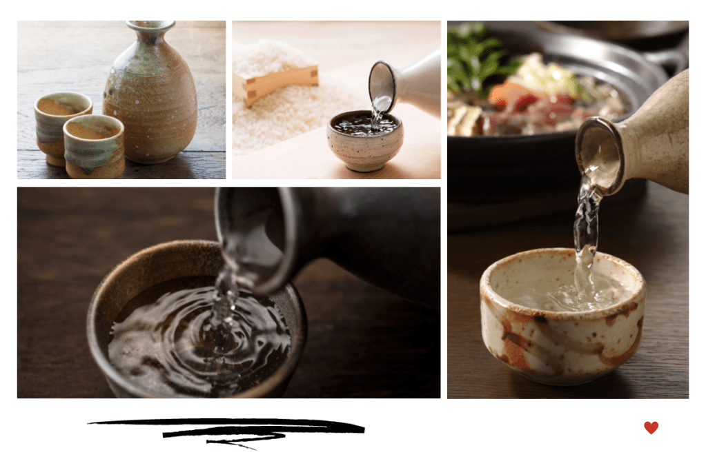
Materials and Techniques Used in Sake Bottle Design
The art of designing sake bottles encompasses a vast variety of processes and mediums. Sake bottles may be found constructed from everything from classic ceramics to cutting-edge polymers. In this post, we’ll look at the many processes and materials that have been utilized to create sake bottles, as well as the pros and cons of each.
In Japan, traditional ceramics are frequently employed in the creation of sake bottles. Ceramics are highly prized because of their longevity, resilience to heat, and capacity to improve the sake’s flavor and fragrance. Sake connoisseurs also place a premium on the distinctive textures and glazes produced by traditional ceramics including stoneware, porcelain, and earthenware. Ceramics are beautiful and versatile, but they may be difficult to deal with due to the complexity of the fire and glazing processes and the possibility of breaking during firing or shipment.
The design of sake bottles often incorporates glass. Glass is prized because its see-through nature allows the sake’s true hue and clarity to shine through. Glass is very simple to manipulate, and may be made into any number of different shapes and sizes. Glass, however, is extremely delicate and prone to shattering or breaking during shipment or handling. The temperature and flavor of sake can be affected by the use of glass since it is not as heat-resistant as other materials.
Lastly, many modern designers of sake bottles are experimenting with non-traditional materials including plastics, metals, and even 3D-printed ceramics. Durability, portability, and the freedom to experiment with new shapes and textures are just a few of the advantages of these materials. It’s possible that these materials won’t hold up as well to high temperatures or do as much to improve the sake’s flavor and fragrance. Also, there is the possibility of criticism from those who believe these materials to be culturally and aesthetically less significant than conventional ceramics.
The Role of Aesthetics in Sake Bottle Design
Creating a stunning container for sake is an art form in and of itself. The packaging of sake is more than simply a matter of personal preference; it may also have an effect on how the product and its brand are received. From the label and packaging to the bottle’s color and form, aesthetics play a major part in the creation of a sake bottle. In this piece, we’ll look at how aesthetic considerations like color, form, and texture play a part in the design of sake bottles, helping to create a one-of-a-kind and unforgettable drinking experience.
As the color of a bottle affects how a consumer feels about the contents, it is important to consider color while designing a bottle for sake. A feeling of excitement or playfulness may be achieved with bright, strong colors, while a sense of refinement or elegance can be achieved with subdued, neutral tones. The color of the bottle may also have an effect on how the sake tastes, since different hues are often connected with various aromas and tastes.
The visual value of a sake bottle may also be greatly impacted by its form. As compared to a more conventional or standard shape, which may be perceived as more conservative or safe, one with a memorable and distinctive form might evoke curiosity and attention. Moreover, the form of the container may affect how the sake is poured and eaten, with certain bottle shapes being better suited to particular serving techniques.
The texture of a sake bottle may add additional dimension to the sensory experience it provides to the drinker. A rough or textured surface might evoke feelings of rusticity or earthiness, whereas a polished or smooth one can evoke feelings of refinement or elegance. Even the sake’s handling and pouring may be affected by the bottle’s texture, with some being easier to hold than others.
The Importance of Sake Bottle Labeling for Branding and Sales
The label on a bottle of sake may make or break the product’s reputation and ability to sell. When a customer encounters a product for the first time, they may form an impression of it based just on the label. Design components like font, images, and content may combine to make a memorable and successful sake bottle label, which will be discussed in this article.
The legibility and reading of a sake bottle‘s label is greatly impacted by the typography used to create the label. A well-designed label will make use of legible, easily-recognized typefaces that also help establish the identity of the business. Furthermore, the label’s typography may be utilized to establish a hierarchy, drawing attention to the most important information and highlighting the product’s best qualities.
The labeling of sake bottles is also significant since it provides a visual image of the product and the brand. Memorable and striking visuals are key to a label that successfully establishes the product’s unique selling proposition. Moreover, a brand’s visual identity may be given a sense of narrative via the use of images, which can further strengthen the brand’s ability to strike an emotional chord with the target audience.
Labeling for sake bottles is very important because of the message it conveys about the beverage and the company behind it. An effective label will convey its message in a way that is easy to understand but yet piques the buyer’s curiosity. You may use messaging to make your product seem more valuable and higher-quality by drawing attention to its best features and benefits. A favorable and memorable experience with a brand may be fostered by the label on a bottle of sake, leading to repeat purchases and brand loyalty.
